
AICE media studies period 8 Blog Post #4


 Rule of thirds 

1. The camera work allows for the young black gentleman in frame to really be a prime focus of the image with a secondary focus of what he is doing 

2. The audience should feel happy seeing the man smile as he reads a book interested in what he is reading


 Deep Focus 

1. This photo allows to get a good facial analysis of who this humble young man allowing to see the demeanor of his face establishing character 

2. The audience should feel understanding of who this is and how they are feeling within the moment


Shallow focus

1. The photo allows to capture the background while keeping an emphasis on the person in the photo seeing the mood in the setting he's in

2. This allows the audience to feel a sense of immersion seeing the character and the setting allowing to feel the appropriate emotions within the setting


Focus pull

1. The structure of the camera allows to capture a dual focus of one character to another that has more interesting movements

2. This video makes the audience feels funny because its funny seeing a kid in the background doing a random dance behind a very serious looking young gentleman
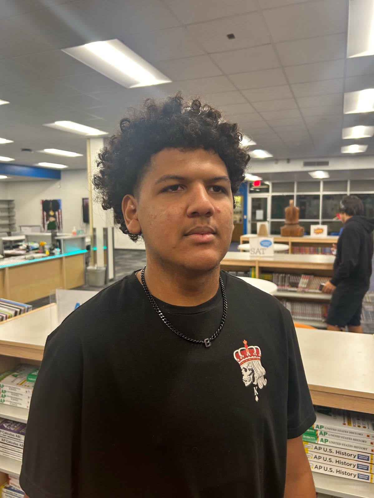

Standard Focus

1. This image structure a concrete photo of my humble young friend Ethan seeing his goofy front to the camera

2. The picture makes the audience feel funny seeing a goofy face focused on by the camera and interested in why he's looking that way

Comments

Popular posts from this blog

Peer review

 https://youtu.be/CEkDC6U4KYU?si=Ziw6ViRZCos_m_7L In the opening above I particularly enjoyed the insert shots between the emails. I didn't like the ending, the sudden stop and no real emotion conveyed on the characters face felt off not really making me want to know what happens further. The mis en scene of the opener also didn't feel right. nothing seemed confusing the opener was straight forward and easy to understand. I suggest to make the movie opener better they should make the lighting a little bit darker in the therapy room and change up the ending a little to make the therapist seem a little bit more emotion regarding the girls case.  https://youtu.be/eX32iRuSMvc In the opening film above I liked the subtle music playing in the background it helped me understand the genre of the movie. I didn't really like the lack of depth with the characters especially since its romance genre I would've liked more dialogue. I wasn't really interested in the rest of the mo...

peer review evaluation

This week, my group went over the peer reviews written by our classmates to asses their feedback and determine if there are any suggestions we'd like to implement into our final cut.  Peer review #1 (by Johansen Rey) :https://johansenrey.blogspot.com/2025/04/title-sequence.html  My favorite part of this opening sequence is definitely the ending and the editing done while the surgeon rips his face mask. It reveals a man who is clearly disturbed and this is also accomplished by the tilt shot that shows the blood squirting on him. The editing was great and the grey filter on the actor makes him look psychotic. I didn’t really like the lighting, it was very bright but I believe that the lighting should’ve been a bit darker. If the film had included some lowkey lighting to help add to the ominous atmosphere of the scene, it would have been better. The setting would have also been a bit more unsettling and worrisome for the audience. I do think it looked like an opening sequence as ...

Title Sequence Final

The font we chose to use was shlop because it seems scary and horror themed which is the direction our Opening sequence heads towards. We made sure that the actual title of the movie was red to resemble a bloody name to create a creepy and scary vibe. The credits role one name at a time by what service and/or acting was done by that person. We came to this decision because we wanted to highlight the font and style of the title sequence text to catch the vibe of the opening sequence better after it finished. We chose this because in the end this style and font captures what we imagined the opening sequence to give off it was meant to be creepy and install fear.