
Moodboard blogpost AICE media studies


I made a choice of a nice family house on Christmas. I chose this because its a warm and comforting setting to sit back and enjoy and makes you feel at home bringing nothing but smiles. I want the audience to assume that the characters are filled with joy because of Christmas day and the location provides a stable of what Christmas should be in a home 
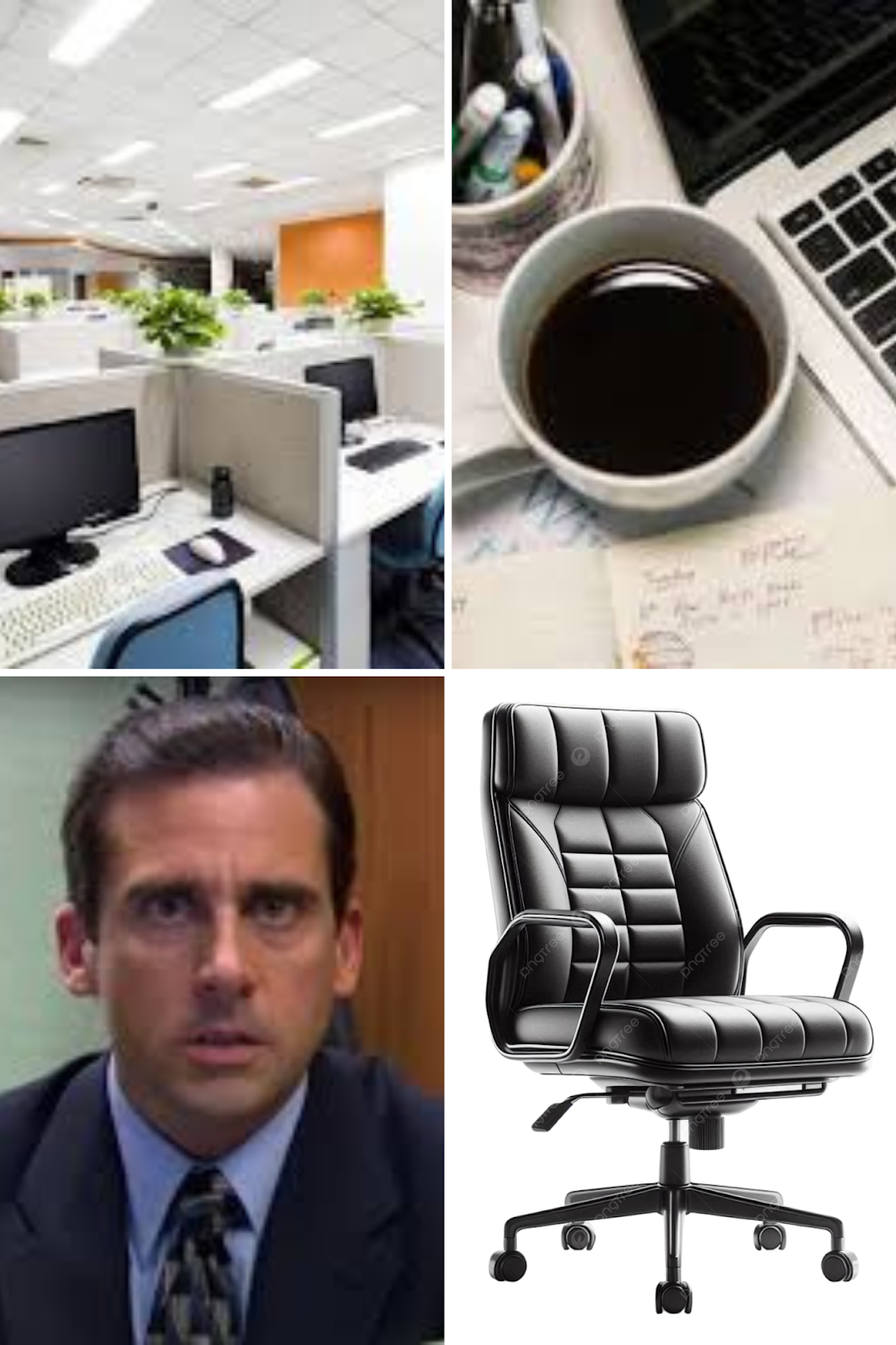


I made the choice of an office setting. I made this choice because of the casual and more than what meets the surface vibe an office has. I want the audience to feel like regardless of the fact the office is filled with people and can seem so average and boring each individual person there has a life and things they struggle with and want to achieve.


I made the choices of an outside southern cookout. I made this choice because its a familiar sight that is really easy to visualize and making a good movie scene to develop characters and laugh at. I want the audience to assume that the characters are all very close and cultured and the location gives off a warm enviornment for family to be conversate and make jokes.


I made the choice of a skyline apartment. I made this choice because of the scenery, interest, and somewhere I want to live in the future. I want the audience to assume that the characters are wealthy and mean business living in a big city due to a skyline apartment location and expense. 


Comments

Popular posts from this blog

peer review evaluation

This week, my group went over the peer reviews written by our classmates to asses their feedback and determine if there are any suggestions we'd like to implement into our final cut.  Peer review #1 (by Johansen Rey) :https://johansenrey.blogspot.com/2025/04/title-sequence.html  My favorite part of this opening sequence is definitely the ending and the editing done while the surgeon rips his face mask. It reveals a man who is clearly disturbed and this is also accomplished by the tilt shot that shows the blood squirting on him. The editing was great and the grey filter on the actor makes him look psychotic. I didn’t really like the lighting, it was very bright but I believe that the lighting should’ve been a bit darker. If the film had included some lowkey lighting to help add to the ominous atmosphere of the scene, it would have been better. The setting would have also been a bit more unsettling and worrisome for the audience. I do think it looked like an opening sequence as ...

sample exam question

 Cross media synergies are used by media companies are used around the world to help promote and stream new upcoming media. If a distributer doesn't own their own streaming service they can call upon others to help stream their media. in addition can use social media apps such as Twitter, Instagram, and Tiktok to promote a new project or film coming up and this is commonly used today.     An example of these cross synergised being used is when Universal pictures was promoting the Super Mario Movie. One of many ways they promoted this movie was by contacting Mcdonalds to put super mario toys in happy meals to help promote the new movie. Happy meals are a way to promote this movie to its target audience being children and getting families to tag along. Furthermore collaborating with nintendo to help promote and advertise the movie in one of nintendos most important semi anually presentations called "Nintendo Direct" to promote and advertise the new movie coming out the mill...

Title Sequence Final

The font we chose to use was shlop because it seems scary and horror themed which is the direction our Opening sequence heads towards. We made sure that the actual title of the movie was red to resemble a bloody name to create a creepy and scary vibe. The credits role one name at a time by what service and/or acting was done by that person. We came to this decision because we wanted to highlight the font and style of the title sequence text to catch the vibe of the opening sequence better after it finished. We chose this because in the end this style and font captures what we imagined the opening sequence to give off it was meant to be creepy and install fear.